March Design Favorites
While productivity and efficiency are at the top of every converters list, good design shouldn’t go unnoticed. A way to remain competitive is to offer advice to brand owners, sharing what the latest packaging trends are and how your technology can do it all. Plus, how can you ignore the added premiums you rake in from complex specialty applications?
At Mark Andy, we appreciate good design as well and look to trending label aesthetic to ensure our equipment is fully optimized for what the market and consumers require.
Below is our carefully curated list of label and packaging design favorites published during the month of March. Enjoy!
Martin City Brewery
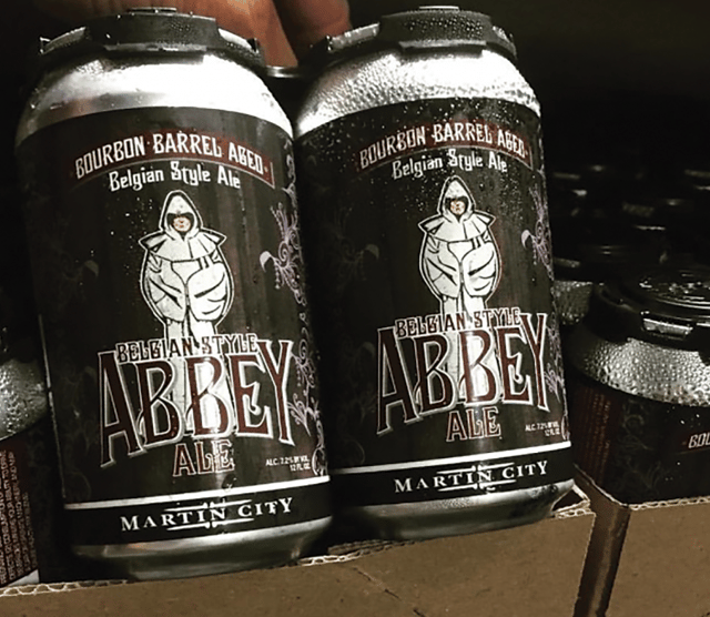
Photo courtesy of Packaging World
Missouri-based craft beer company, Martin City Brewery, uses pressure sensitive BOPP labels on their cans and bottles in place of traditional glue applied paper labels. We love the rich brown colors and interesting font on their Belgian-style ale label. Bonus points are also earned for the fact Martin City partners with Label Solutions to print these bad boys on their Mark Andy Digital Series.
Click here for the full story.
Hellmann’s Mayonnaise
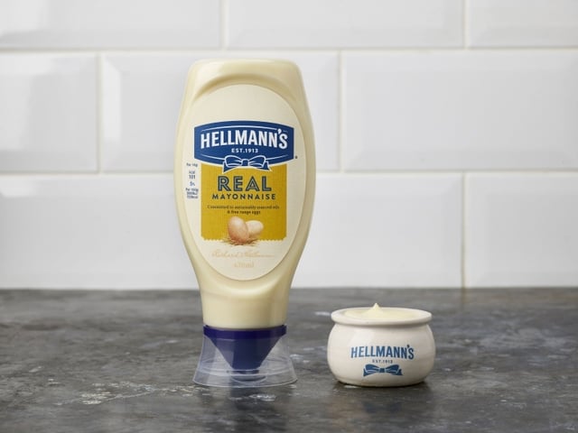
Photo courtesy of Design Week
Hellmann’s mayonnaise is a staple in American homes. Something about its classic blue and yellow pressure-sensitive labels invokes major feelings of nostalgia and we love that the rebrand stayed true to their visual identity. The new and improved rustic design elevates shelf-appeal and gives off the specialty-deli vibes that the brand was yearning for.
Click here for the full story.
Whistler Brewing Co.
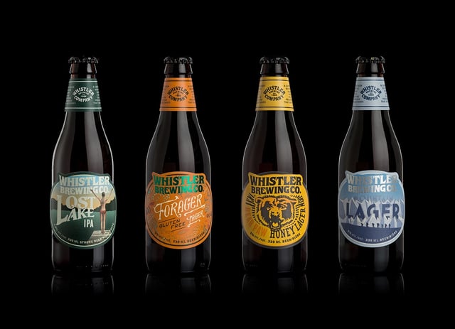
Photo courtesy of The Dieline
What’s not to love about non-traditional die cuts and funky metallic lettering? Whistler Brewing Co. visually articulate flavor profiles of each beverage through their unique creative and we are impressed by how these labels bring the brewery’s personality to life. A+ design!
To view the full story and additional images, click here.
Coffee-Mate
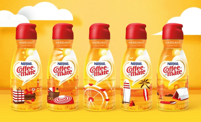
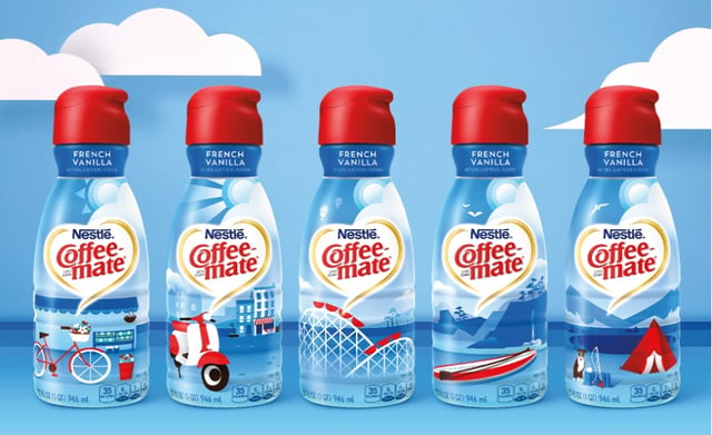
Photos courtesy of Packaging Strategies
Coffee-Mate just released a seasonal summer design for their Hazelnut and French Vanilla coffee creamers. The adventurous variable images printed on the blue and yellow shrink sleeves are guaranteed to put an extra ounce of pep in your morning cup of joe. Versioned graphics like this have a special spot in our hearts here at Mark Andy. Yes, we’re talking about you, Digital Series Pre-Press Team.
The full feature can be accessed here.